16 July 2008

Real Wedding > Katie & Chris


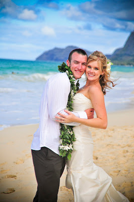
Katie & Chris' Maui themed wedding was flush with bright oranges, lime greens, earthy dark brown and a full palette of bright tropical colors.  Color was the key inspiration of their save the date and invitation.

The wedding took place on the island of Maui with an intimate gathering of family and friends on August 21st.  Just eight days later on the 29th they held a grand reception at Catta Verdera Country Club in Lincoln, California.

Don't you just love Katie's shoes?!  I absolutely adore the bright pop of color she included with her shoes - they serve as a little surprise and really show her personality.

Congratulations, Katie & Chris! 

Wedding day photography courtesy of Stephen Ludwig Photography

15 July 2008

Fan-tea-bulous!


So ... I love iced tea and especially when we're smack-dab in the middle of the hot, hot summer months here in Sacramento.  I have had a difficult time finding a tea that is not bitter or has a funky sorta after taste.  I want a tea that is crystal clear and doesn't need to be sweetened.  Found it!  Luzianne tea is it!  It is made especially for iced tea and one tea bag makes a quart (quart=4 cups - I had to look it up so thought I'd share!).  

Purchase directly from Luzianne.  Oh, so fabulous.

Photo courtesy of Art.com.

11 July 2008

Lift Off


The long awaited launch of my new website ... yeehoo!  It's finally up!  I'm really pleased with the design and navigation and hope that you find it just as user friendly.  The color scheme is quite a change from the last site, but much more in line with my design philosophy overall.  I like to keep things warm & simple - then play with vibrant pops of color.  It is by all means a work in progress.  I have tons of gallery images still to post and am working on the numerous resource documents for "the library".  I'll have updates to post weekly, here on the blog, to notify everyone of site updates.

A little about what's new - the greatest change to the site is what I call "the library" - I wanted to create a resource page with design samples, paper selections, fonts, wording, you name it.  My intention is for "the library" to help jump start the creative process by allowing clients to browse and inform themselves with the available materials, embellishments and design elements at their leisure.  

Quality photography was extremely important to me this go round with my site.  I really wanted to show the texture and depth of my designs - as well as the sparkle in the crystals/papers as best as I could.  A lot of the photos I took myself - since I love the art of photography.  There are a great number of photos that my good friends at The Memory Journalists shot for me.  I am so grateful for their creative eye and attention to detail.  See some of their work above and throughout the website.

It's 235am and I need to wrap it up for the night.  TTFN.

10 July 2008

It's aBlog Time!


I'm creating this blog to keep everyone up to date on the day to day going's on with my little family & the roller coaster ride which is my custom stationery business, Stephanie J Designs.  I truly hope that you all look forward to new entries, share and enjoy my little writings.

I just did a little photo shoot here at the house last week of some invitations from last year and early this year.  Yes, that's right - invites from from last year.  I think I even have a few from late 2006 I never took photos of!  I barely have time to sleep let alone take photos of my invites.  I have so many more to go ... but loved how these turned out from last week and had to share. 

Meet Laine & Joe Alves' wedding invitation.  Designed using their color theme of turquoise, antique gold and bronze - with rich texture and color it is really striking in person.  And as a couple they are super sweet and a pleasure to work with.